Logo Design - Thoughts?
MuleyMadness
4/17/15 10:39pm
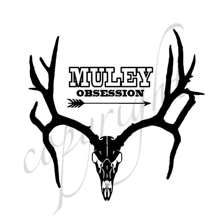
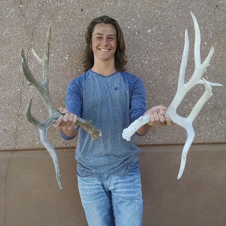
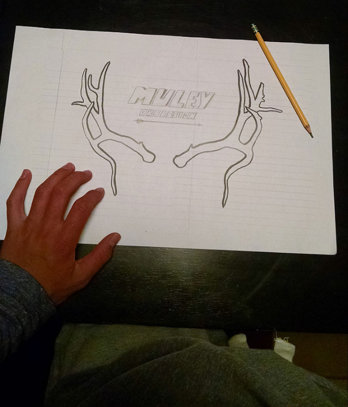
Friend of mine recently found the sheds, we took a pic of the sheds, he sketched a logo design and what he might like and was working on. I then did the rest in Photoshop and Illustrator. What do you guys think? He was beyond excited and ecstatic to see the final logo (even though it's actually not done yet). :)
His words were "that's the sickest thing I've ever seen" ha ha
He had no idea I was going to do the design, he was just showing me his cool sheds and I surprised him.
His words were "that's the sickest thing I've ever seen" ha ha
He had no idea I was going to do the design, he was just showing me his cool sheds and I surprised him.
13,842
hound_hunter
4/19/15 11:16am
UnREAL set of sheds!!! When looking at that logo I would typically think "yeah that's awesome but no deer actually looks like that", when I see the logo and the pic of the sheds together I am in AWE!!! Very cool
43
JDavid
4/19/15 11:45am
Thumbs ups here
43
Muley Stalker
4/19/15 12:20pm
It looks good, but i'm sort of fond of the one you have now too. I have one of your hats with it.
43
MuleyMadness
4/19/15 2:36pm
Thanks guys, that's the cool thing about this logo...I great with hound_hunter. You wouldn't think it's real until you see the actual sheds and pics. Makes is that much cooler IMO.
43
Muley Stalker
4/20/15 1:02pm
Speaking of hats. Will the red hat you sell pass in blaze orange legal states? It looks more blaze orange than red, but sometimes pictures have different lighting.
43
MuleyMadness
4/20/15 2:27pm
I assume you mean the Elk one? It's pretty red red, so I doubt it. :)
43
Muley Stalker
4/20/15 2:46pm
No, not the elk hat. This one.
http://www.muleymadness.com/store/red-deer-hunting-hat/
43
MuleyMadness
4/20/15 4:17pm
Oh, it's red red too. :)
43
Muley Stalker
4/20/15 8:10pm
Well, nuts! I was trying to kill two birds with one stone. A new hat that I can hunt in too.
43
ridgetop
4/20/15 8:48pm
How long are those main beams?
43
MuleyMadness
4/21/15 12:12pm
Not sure Ridge, I'll have to ask him. I didn't measure them.
43
JBird
4/24/15 1:14pm
That's sweet. I love the drop down beams. As far as the logo I think the text could be a little more fluid if that makes sense. The block lettering doesn't flow, I think some form of script type would be better and it kind of goes along with those flowing beams. And the position might be better under the skull. I feel like it detracts from the rack being in the middle. Sorry I probably way over analyzed that, it's pretty awesome.
43
MuleyMadness
4/24/15 2:30pm
Feel free to critique, doesn't bother me. I'm just going off what he wanted. :)
43
MuleyMadness
4/26/15 8:18am
He said they were 23", they look a longer than that to me though. :)
43
mjensen1313
7/30/15 11:25am
Love the art work, don't care much for the lettering. Tons of character in them sheds!
43