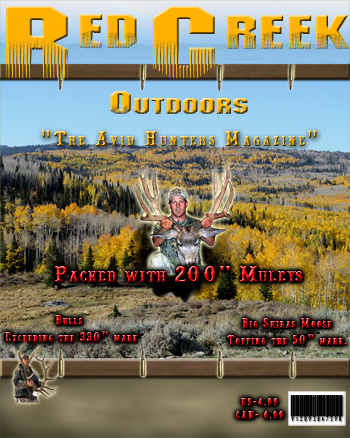
Need some feedback on magazine cover

Hey guys I want you to look at my magazine cover and give me some feedback on what you like and dont like.

thanks,
mossback300
8,014
bigbuck92
weres the cover?
15
bigbuck92
o ok now i can see it. it looks good
15
MuleyMadness
Okay I'm going to get crap for this, but I think it's OKAY is all.

You wanted my opinion so don't take offense. :)

Love the scenery background picture, dont like the red/black font. Buck in center needs to be MUCH bigger. Not sure I'm a fan of the bullets. Okay I better stop, good start though. :thumb
15
FastGM3
"MuleyMadness" wrote:Okay I'm going to get crap for this, but I think it's OKAY is all.

You wanted my opinion so don't take offense. :)

Love the scenery background picture, dont like the red/black font. Buck in center needs to be MUCH bigger. Not sure I'm a fan of the bullets. Okay I better stop, good start though. :thumb
Just so MuleyMadness isn't the only one taking the heat, I tend to agree with everything he said. I know it's probably not actual size, but I can barely read the small red/black fonts in the lower right/left corner. I'm sure you spent a few hours trying different fonts and pics, so I hope your not offended.

You did ask, right? You wouldn't want us to lie to you, would you?
15
Default Avatar
Well i don't like that that's not ME holding that big buck!!
It looks great other than that though!! =D>
15
Utahbowhunter
Ok... I agree with brett. Its okay. Yeah the guy with the buck should be bigger. Maybe put it to the side. Same with the guy with the elk. make that a little bigger too. Yeah i dont like the bullets that much either. But hey still looks good!!! :thumb
15
Default Avatar
Guys the reason why the pictures are so small is because there only 72 dpi and I'am taking them into a 300 dpi magazine cover and thats is big as I could get them without being fuzzy. But thanks for the feedback no offense takin.

Thanks,
Mossback300
15
270
:-k

Good to hear the people & deer & elk will be bigger!

IMHO = For me there is too much yellow ?!?
the words and the trees? maybe try a different color for the writing? especially the "The Avid Hunters Magazine"

I don't mind the bullets on the bottom but not so much on the top?

so you gonna give us a copy of this magazine for our input :)
15
kadejones2
looks perty good to me
15
MuleyCrazed
I will agree with the others. The pic should be the center of attention on the cover. There is a lot of color, maybe too much. The layout is great! I just think that what you want to market is the big bucks so the pic should be the focus. The red font might a little too distracting. Your concept and design is awesome. It just needs a little editing. Awesome job! I would pick it up at a magazine rack! Anything to do with monster mule deer! Thanks for sharing
15
Default Avatar
Actually guys this isn't a real magazine yet, I had to make a magazine cover for my college class and wanted some peoples feedback from the hunting perspective because in my college theres a lot of people that are for pita. I'am going to college in graphic and web design so thats why I'am doing this. I appreciate all of your feedback I will fix all the errors and post it again and see if you like it better.
15
RooDog
I like the yellow words but I don't like the red at all. I like the bullet idea but turn them sideways so they fit inside the strips. Just my 2cents.
15
Default Avatar
I dont like it. If I were you I would try again.
15
Default Avatar
It looks ok. I don't know enough about printing up stuff like that, but it would definitely be better if the picture of the hunter and his buck were much bigger. They should be prominent, if not the only thing on the cover.
15
Default Avatar
Yeah like the web master said why is the buck so small couldn't shoot a big one that year? LOL just kidding it's excellent.
I like the colors on the cover it would catch my attention if it was on the rack. Of course I've been told I have ADD so......................Is that Bill Dance on tv, dang he can catch fis..............I smell apple pie, I love apple .......err what were we talking about?
Anyways I like it, try to get the Buck bigger.
15
fatrooster
I would use a gorgeous blonde woman in a camo bikini holding up that buck. I guess a brunette would be OK, ha ha. Then the background and letter colors wouldn't even matter, lol. Seriously though, I'd love to see a magazine about Do It Youreself Hunters. No guides, no landowner tags, no special privlidges whatsoever. Just a real average Joe mag doing it the hard way. Anyways, goodluck with your assignment and with the harrassment you will get from the pet killing PETA people. fatrooster.
15